Safe Cents

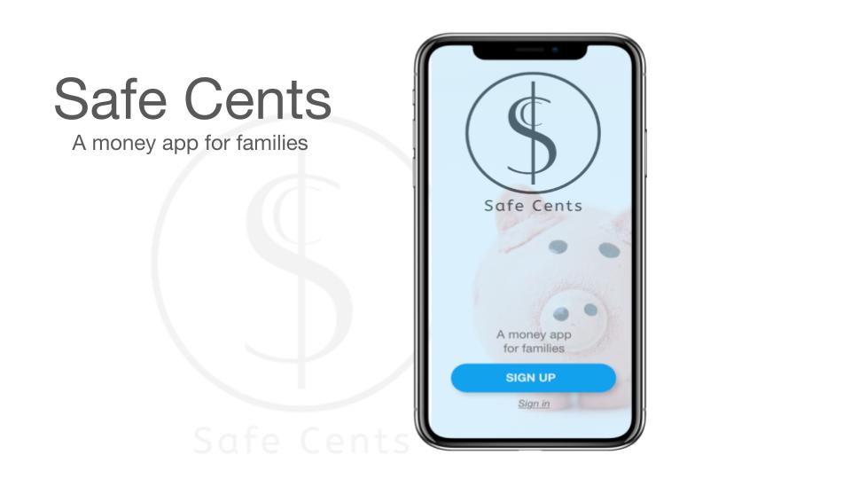
Safe Cents is a responsive web app that parents can use to easily send kids money and monitor how they spend it.
Project Image

About
Safe Cents is a financial app for parents where they can add kid accounts with parental controls. Parents are able to easily send their kids money and monitor how they spend it. Kids can easily spend money without waiting for a parent to have time to help them. 
Safe Cents is a responsive web based design. I followed material design standards while addressing the UI, and I focused on its use as a mobile app because that would be the most useful version for its users. 

My RoleI was the lead UX/UI Designer. I was responsible for: 

Research 
Design 
Prototyping 
Testing


“I would like an alert on (kids) dangerous spending”

-Parent


The Problem

“Parents need a way to send, save, move money and add kid accounts to their financial apps. They would like a safe and easy way to send their kids money with oversight (permission/controls). Kids would like a safe and easy way to send, save, and move money, so that they can monitor and control their finances easily.”


“We will know this to be true when we see parents using our app, adding one or more kid accounts with parental controls, and kids sending, saving and moving money in a safely monitored way.”


Research

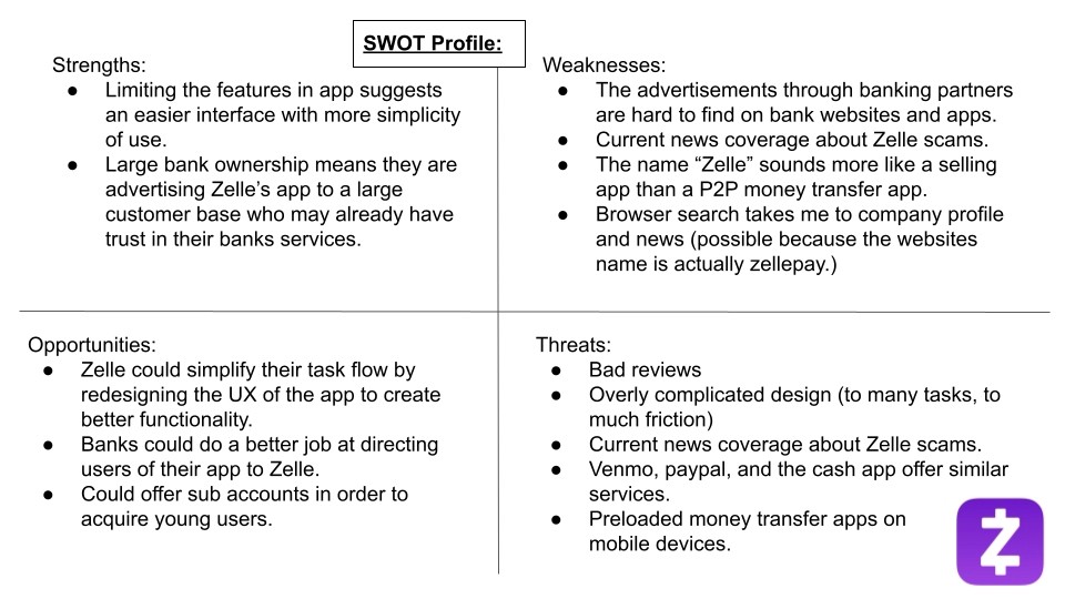
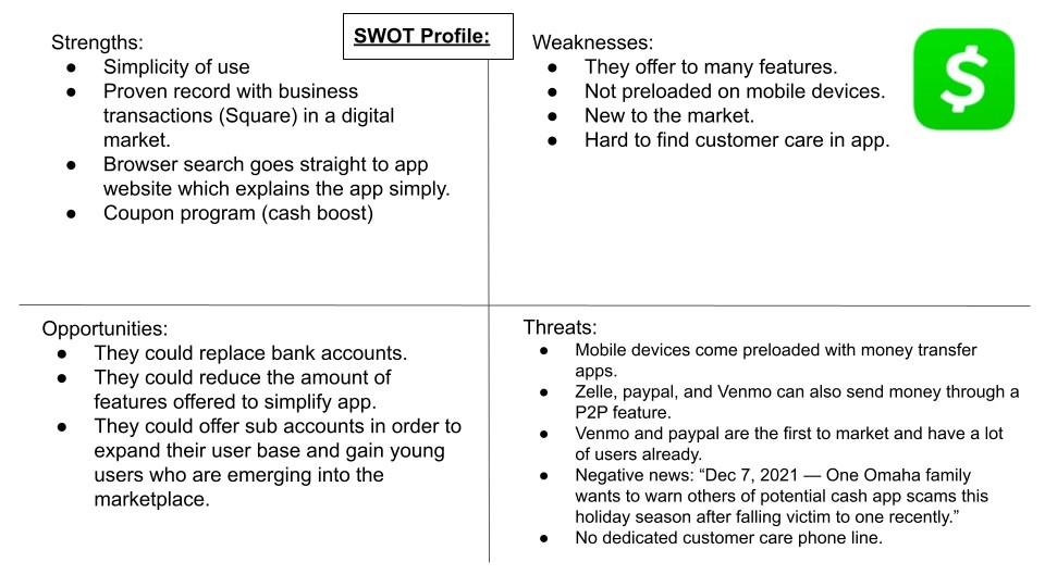
I used competitive analysis, surveys, and interviews for my initial research. I found gaps, opportunities, and inspiration.

Cash App
Project Image

Zelle App

Project Image

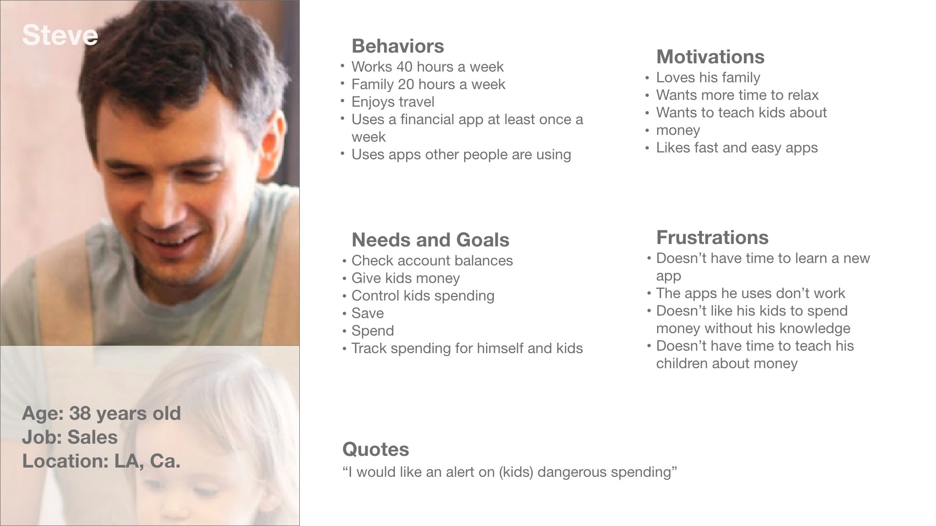
Personas 

As a result of this information I was able to craft user personas, user/job stories, task analysis, and user flows.
Project Image

User Story

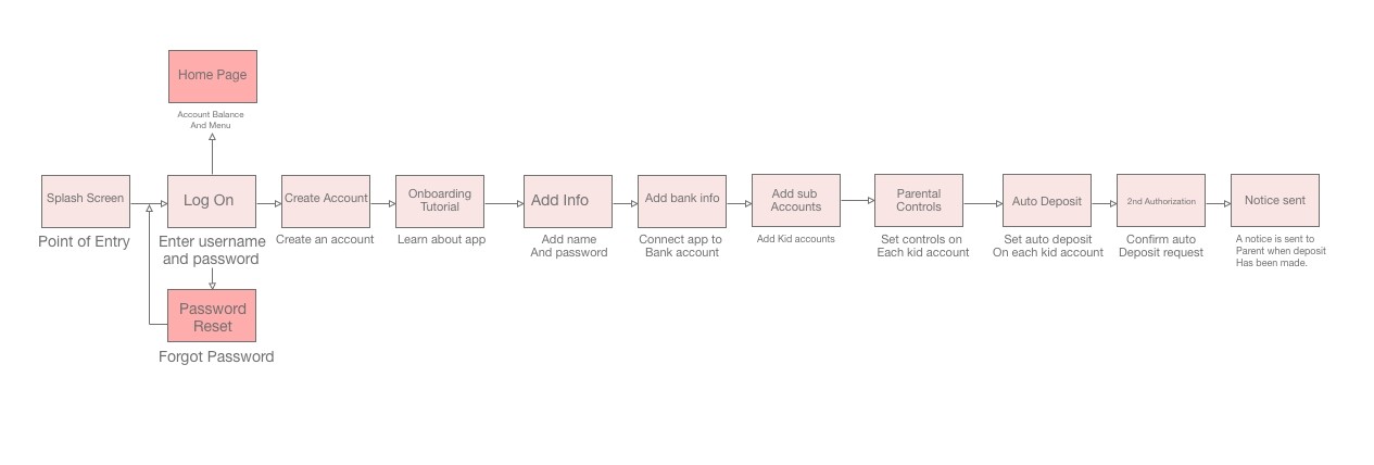
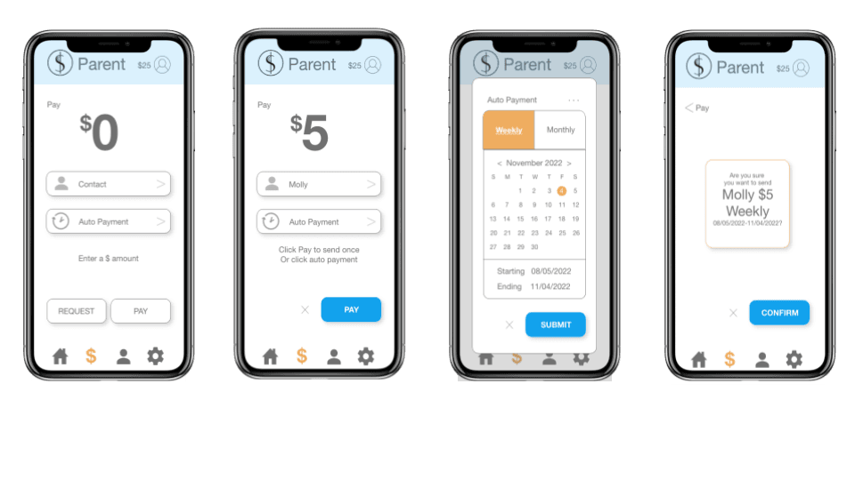
As a parent, I want to give my child his/her allowance digitally, so that I don’t waste time driving around town looking for cash.

User Flow
Project Image

Auto Payment Wireframes-for an allowance
Project Image
Project Image

User Story

As a child, I want to go shopping, so that I can spend my money.

User Flow

Project Image

Child Spending Notification Wireframes

Project Image


Site Map

My original site map reflected a lot of this information and inspiration, however after card sorting I discovered issues with my original design. I reordered the placement of features to make them easier to find.

✍︎

Wireframes

I created low, mid, and high fidelity wireframes, with the site map, user flows, task analysis and inspiration I had. I checked my design by applying usability heuristics.

Inspiration

Project Image

Splash Screen

These are the first three versions of Safe Cents splash screen.

Project Image

Dashboard 

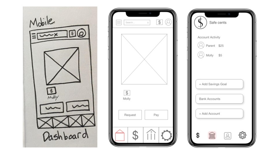
These are the first three versions of Safe Cents dashboard. One of my many findings, through the process of card sorting, I discovered what a parent wanted and expected to see on the dashboard. They preferred to see account activity first and then send a payment, so I updated Safe Cents accordingly.

Project Image

Testing

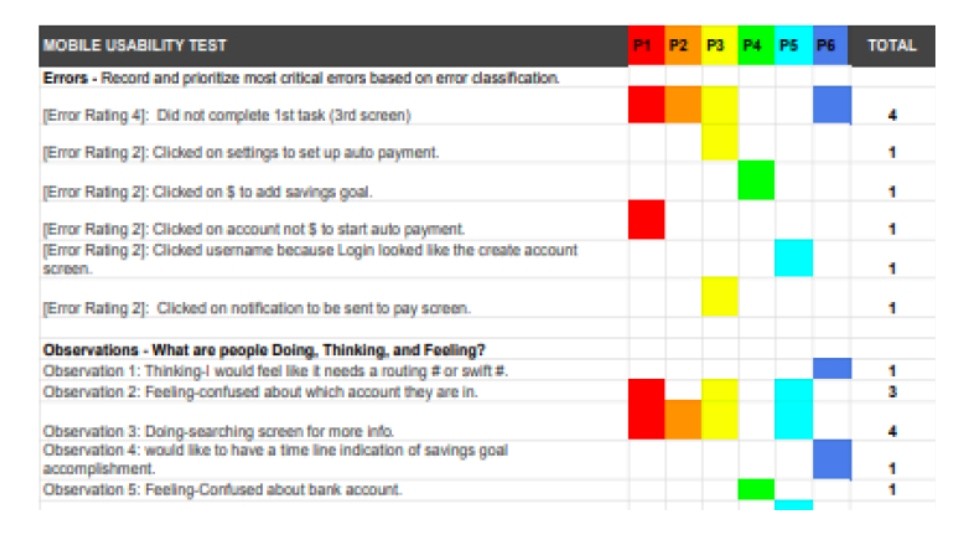
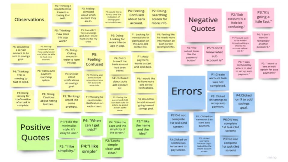
After creating wire frames I quickly prototyped the design in order to test it. Some of the tests I used on Safe Cents were moderated virtual usability testing, a system usability survey (SUS), and preference tests. I then analyzed the results with an affinity map and a rainbow spreadsheet. 

Affinity Map

Project Image

Rainbow Spreadsheet

Project Image

Preference testing

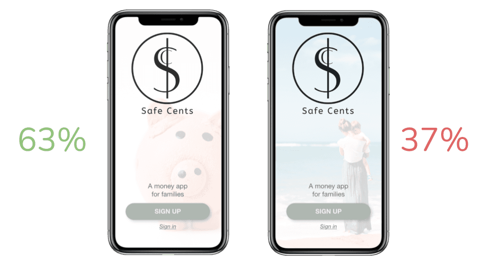
Here is an example of one of the preference tests used for Safe Cents. Users were asked which splash screen they preferred. The following is the result.

Project Image

Iterations

I applied what I had learned as well as Material design, Principles of design, Gestalt laws, and the psychology of color standards to the Safe Cents design. I asked my peers and mentor for feedback on ways to improve. I also applied changes to the design based upon WCAG accessibility design standards. The following is the documentation of a few of those changes and reasoning behind each decision.

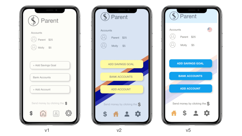
Dashboard - Iterations

Changed bank to home icon for familiarity          

Added color for fun         

Lighter background for Accessibility 

Project Image

Create an Account - Iterations

Blue stands for work                            

No need for numbers                          

Added text box labels

Project Image

Final

Every decision was made with the needs and goals of the users in mind. The result is the following final design.

“When can I get this.”

-Parent

Project Image

“When can I get this.”

-Parent

Let me show you how Safe Cents works. Here is a demo video.

Here is a link to the Safe Cents prototype. Enjoy seeing it for yourself.

Link: https://xd.adobe.com/view/6097d93a-6fdb-437d-b310-0cd63b8cb0ec-35c4/

Thank you!

Safe Cents

Safe Cents is a responsive web app that parents can use to easily send kids money and monitor how they spend it.

Project Image

About
Safe Cents is a financial app for parents where they can add kid accounts with parental controls. Parents are able to easily send their kids money and monitor how they spend it. Kids can easily spend money without waiting for a parent to have time to help them. 
Safe Cents is a responsive web based design. I followed material design standards while addressing the UI, and I focused on its use as a mobile app because that would be the most useful version for its users. 

My RoleI was the lead UX/UI Designer. I was responsible for: 

Research 
Design 
Prototyping 
Testing


“I would like an alert on (kids) dangerous spending”

-Parent


The Problem

“Parents need a way to send, save, move money and add kid accounts to their financial apps. They would like a safe and easy way to send their kids money with oversight (permission/controls). Kids would like a safe and easy way to send, save, and move money, so that they can monitor and control their finances easily.”


“We will know this to be true when we see parents using our app, adding one or more kid accounts with parental controls, and kids sending, saving and moving money in a safely monitored way.”


Research

I used competitive analysis, surveys, and interviews for my initial research. I found gaps, opportunities, and inspiration.

Cash App

Project Image

Zelle App

Project Image

Personas 

As a result of this information I was able to craft user personas, user/job stories, task analysis, and user flows.

Project Image

User Story

As a parent, I want to give my child his/her allowance digitally, so that I don’t waste time driving around town looking for cash.

User Flow

Project Image

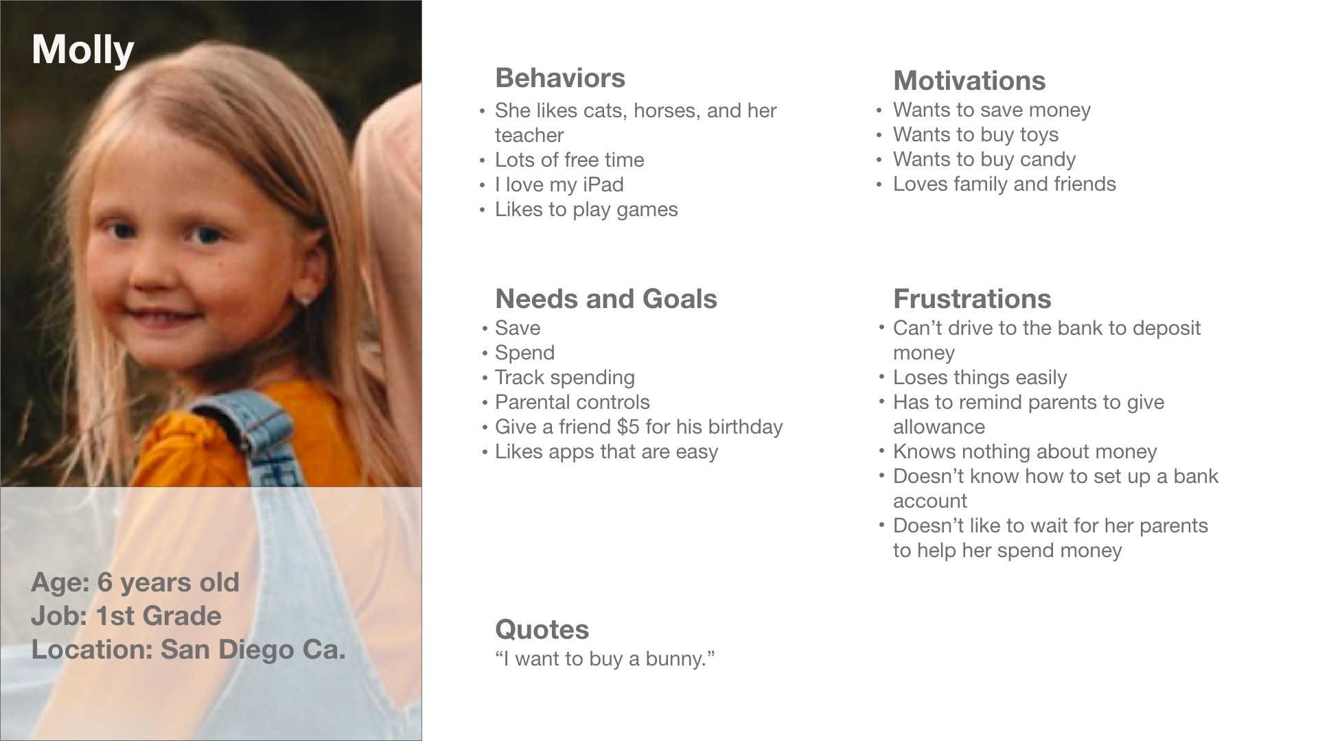
Auto Payment Wireframes-for an allowance
Project Image
Project Image

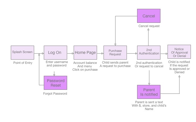
User Story

As a child, I want to go shopping, so that I can spend my money.

User Flow
Project Image

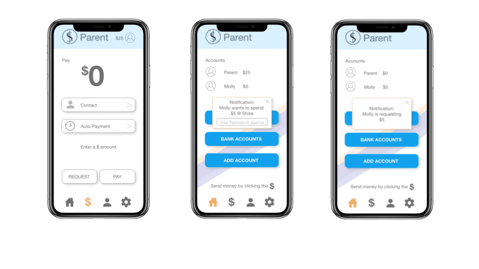
Child Spending Notification Wireframes
Project Image


Site Map

My original site map reflected a lot of this information and inspiration, however after card sorting I discovered issues with my original design. I reordered the placement of features to make them easier to find.

✍︎

Wireframes

I created low, mid, and high fidelity wireframes, with the site map, user flows, task analysis and inspiration I had. I checked my design by applying usability heuristics.

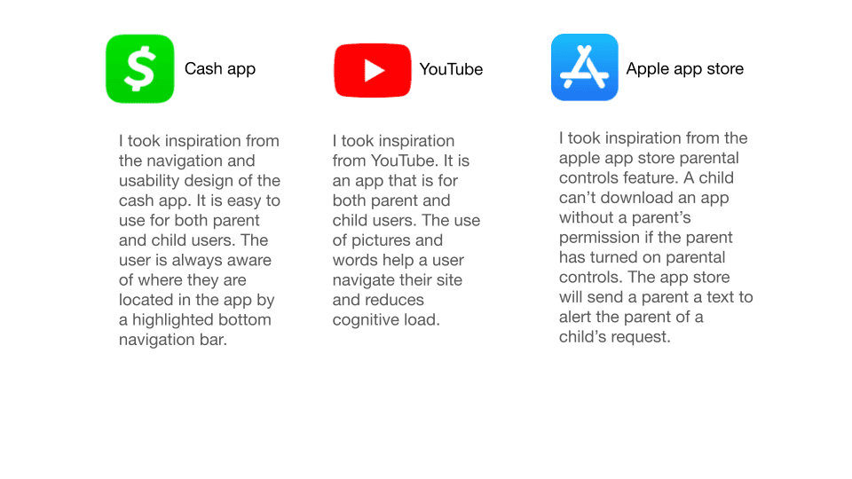
Inspiration
Project Image

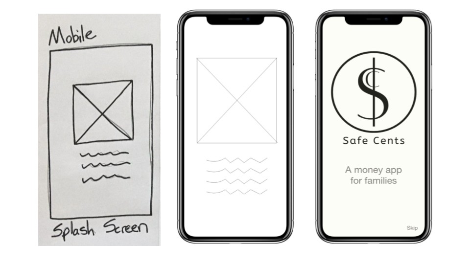
Splash Screen

These are the first three versions of Safe Cents splash screen.
Project Image

Dashboard 

These are the first three versions of Safe Cents dashboard. One of my many findings, through the process of card sorting, I discovered what a parent wanted and expected to see on the dashboard. They preferred to see account activity first and then send a payment, so I updated Safe Cents accordingly.
Project Image

Testing

After creating wire frames I quickly prototyped the design in order to test it. Some of the tests I used on Safe Cents were moderated virtual usability testing, a system usability survey (SUS), and preference tests. I then analyzed the results with an affinity map and a rainbow spreadsheet. 

Affinity Map
Project Image

Rainbow Spreadsheet

Project Image

Preference testing

Here is an example of one of the preference tests used for Safe Cents. Users were asked which splash screen they preferred. The following is the result.
Project Image

Iterations

I applied what I had learned as well as Material design, Principles of design, Gestalt laws, and the psychology of color standards to the Safe Cents design. I asked my peers and mentor for feedback on ways to improve. I also applied changes to the design based upon WCAG accessibility design standards. The following is the documentation of a few of those changes and reasoning behind each decision.

Dashboard - Iterations

Changed bank to home icon for familiarity          

Added color for fun         

Lighter background for Accessibility 
Project Image

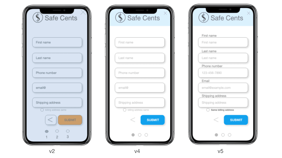
Create an Account - Iterations

Blue stands for work                            

No need for numbers                          

Added text box labels
Project Image

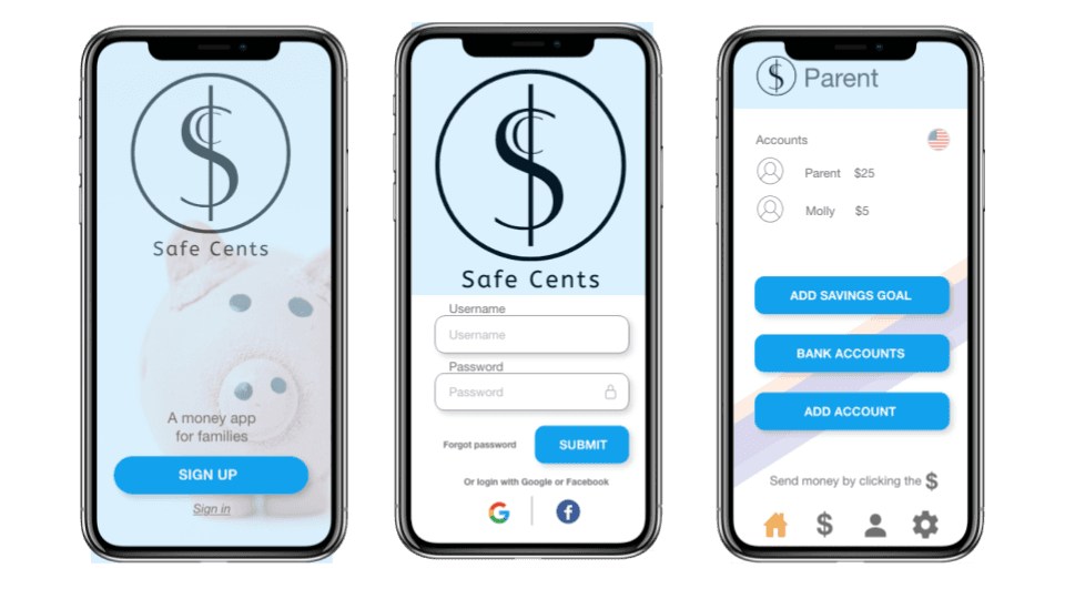
Final

Every decision was made with the needs and goals of the users in mind. The result is the following final design.
“When can I get this.”

-Parent

Project Image

“When can I get this.”

-Parent

Let me show you how Safe Cents works. Here is a demo video.

Here is a link to the Safe Cents prototype. Enjoy seeing it for yourself.

Link: https://xd.adobe.com/view/6097d93a-6fdb-437d-b310-0cd63b8cb0ec-35c4/

Thank you!